Let’s be real — the food scene is flooded. Every week there’s a new burger, a new hotdog, a new “must-try” cafe with the same beige interiors and tired avocado toast.
But Lilbits? We’re not here to blend in. We’re here to blast colour into your cravings and give you a full-on flavour flashback.
We Don’t Just Serve Food. We Serve a Whole Mood.
From our sliders to our socials, everything about Lilbits is designed to feel like a time warp — straight into the fun zone.
We took notes from the 80s. Then we tore them up, added spice, some sarcasm, and built a brand that feels like flipping through your favourite comic book while eating fries dipped in milkshake.
We’re talking:
- Neon fonts
- LEGO-styled packaging
- Vintage arcade themes
- Bold, cheeky captions
- Snack visuals that scream pop fiction
Because why should food feel serious? Why should every brand be beige and minimal? We believe bold flavour deserves bold branding.
The Story Behind the Swag
Our aesthetic wasn’t a fluke. It’s inspired by a time when food was fun, packaging was playful, and ads made you laugh — not scroll past.
Remember when cereal boxes had games on the back? That joy? We’re bringing it back — but in slider form.
We designed Lilbits to feel like a character — not a company. It’s got attitude. It’s cheeky. It’s got that “I’m the main character” energy. And that vibe? It bleeds into every bite, every post, every delivery box.
Nostalgia = Craveability
Science time: nostalgic branding isn’t just cute — it works. Research shows that when a brand taps into memories and pop culture, it forms deeper emotional connections with customers.
At Lilbits, we use that insight like seasoning. Everything we do is infused with retro joy. From our Stranger Things-inspired campaign (“The Upside Down, but with cheese”) to our arcade-style menu boards, every design choice is intentional.
You don’t just eat Lilbits. You feel it.
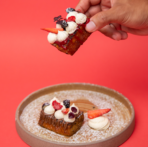
Even Our Food Follows the Theme
It’s not just the branding that gets the retro treatment — our flavours are a love letter to classic combos with a twist.
Think:
- Cheesy chicken bombs that echo your childhood fried chicken cravings
- Truffle sliders that taste like grown-up happy meals
- Chocolate-drenched churros that feel like fairground treats from another dimension
- Milkshakes that belong in a vintage diner but hit with modern flair
It’s comfort food reimagined — for adults who still want to feel like kids when they eat.
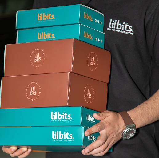
Social Media Built for Sharing, Not Scrolling
Our Instagram? It’s not just a feed — it’s an experience.
We don’t post food. We post energy. Carousels that look like movie posters. Reels that feel like trailers. Static posts with taglines that hit harder than your morning espresso.
We’re not here to whisper. We’re here to shout, “Order that churro, bestie!”
The Lilbits Difference
We’re not just here to fill stomachs. We’re here to build a universe. A world where sliders save the day, milkshakes teleport you to dessert dimensions, and churros fight crime after dark.
This isn’t a gimmick. It’s a promise.
Because when you step into our world — even digitally — we want you to feel something. Joy. Nostalgia. Cravings. Chaos. A moment of “whoa, they actually get me.”
And if we did our job right?
You’ll tell your friends. You’ll post your bites.
And you’ll come back — not just for the food, but for the feeling.